What a win-probability graphic is claiming, and what it is not
The curve on screen is not a prediction about this game. It is a statement about a pile of old games that looked like this one.
Late in a close game a curve appears at the bottom of the screen, and a number next to it says something like seventy-eight per cent. Viewers read it as a forecast: this team will probably win. Then the team loses, and the number gets mocked for having been wrong. Both the reading and the mockery rest on the same misunderstanding, because the number was never a claim about this game at all.
What the model is actually doing
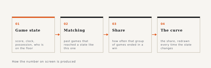
Strip the presentation away and a win-probability model is a lookup. It takes the state of the game — the score difference, the time remaining, which team has the ball, often the period and the foul situation, sometimes who is on the floor — and it goes looking for games that reached a similar state. Then it reports what fraction of that group of games ended in a win for the team in the equivalent position.
So when the screen says seventy-eight per cent, the sentence it is compressing is: "among the historical games we matched to a state like this one, about seventy-eight per cent were won by the team in this position." Every word of that is about other games. The number contains no information about whether the team in front of you is tired, whether its best player has just turned an ankle, or whether the opponent has found something that works.
Why it jumps
A win-probability curve that lurches by twenty points on one possession has not changed its mind. The game state changed, so a different group of historical games is now the relevant one, and that group has a different win rate. The jumpiness is a property of how sharply outcomes depend on state near the end of a close game, which is also the reason the end of a close game is worth watching.
This has a consequence worth internalising: late-game win probability is extremely sensitive and early-game win probability is nearly inert. A model that says fifty-four per cent in the first quarter is saying almost nothing, because almost nothing has happened that constrains the outcome. The same model at thirty seconds is making a tight and defensible statement. Presenting the two with the same visual weight is a design decision that flatters the first one.
Where the models differ from each other
Two broadcasters can show different numbers for the same moment, and both can be competently built. The differences come from choices, not errors.
One is what counts as a similar state. A model that matches only on score and time has a large pool of historical games and a coarse match. A model that also matches on possession, fouls and lineup has a sharper match and a thinner pool, which makes it more responsive and noisier. There is no setting of that dial that is correct for every moment of every game.
Another is which games are in the pool at all. A model built on a decade of games is describing a sport that changed during that decade; the value of a three-point deficit is not what it was when teams took fewer threes. Models handle that by weighting recent seasons more heavily, and how much more heavily is a judgement call.
A third is whether team strength enters at all. A pure state model treats every team in the same position identically. A model that adjusts for who is playing will give a better team a higher number in the same state, which is more informative and also harder to audit, because now the number is carrying an opinion about the teams as well as a count of history.
The thing it is not
It is not a prediction in the sense people use the word when they say a forecast was wrong. A seventy-eight per cent statement is not falsified by one loss; it is falsified by a long run of games in which teams in that position win substantially less than seventy-eight per cent of the time. Judging it off a single outcome is the same error as judging a weather forecast of a thirty per cent chance of rain by whether it rained on Tuesday.
It is also not an odds line, and the resemblance is the most common source of confusion on a modern broadcast, where both can appear in the same frame. A win-probability figure comes out of a historical model. A price comes out of a market, and a market is shaped by where money went as well as by what is likely. They are different kinds of object that happen to be printed in the same units.
The useful habit
When the curve appears, read it as a description of the past rather than a claim about the future, and ask how much time is left. Early, it is decoration. Late, it is the single most compact summary of the situation on screen — and still a statement about a pile of old games, not about this one.