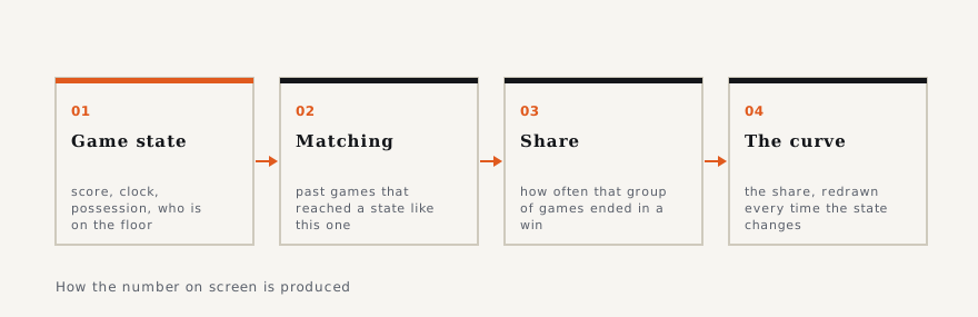
What a win-probability graphic is claiming, and what it is not
The curve on screen is not a prediction about this game. It is a statement about a pile of old games that looked like this one.
What a statistic can and cannot tell you. Rate versus count, sample size, survivorship, and the specific ways sports and gambling numbers get misread. The newest of them is “How a shot chart is built, zone by zone”, from Jun 23, 2026. 6 of the pages came in with a photograph of their own.
A statistic is a sentence with the words taken out, and the argument is almost always about which words those were. This section puts them back: what a rate measures that a count cannot, why a per-game average flatters a starter, when a sample is too small to mean anything, and how a number that is perfectly correct ends up telling you the opposite of the truth.
The pages are built to be read in any order and to be used while you are looking at something else — a box score, a table, a broadcast graphic. Each one takes a single measure, says plainly what goes into it, shows the case where it works and then the case where it breaks, which is usually the more useful half.
Nothing here is modelling and none of it predicts a result. Where a figure appears it comes from a stated source and is reproduced as published; where we could not find a source, the figure is left out rather than estimated. The method, including what we do when two sources disagree, is set out in How we work.
The curve on screen is not a prediction about this game. It is a statement about a pile of old games that looked like this one.
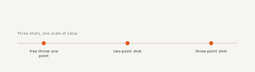
Field-goal percentage treats a layup and a corner three as the same event. True shooting is the fix, and it is simpler than its name suggests.
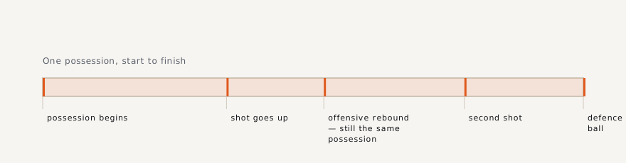
Every modern basketball argument runs on one fraction, and almost nobody says out loud what goes in the denominator. Here is the whole of it.