How a shot chart is built, zone by zone
A shot chart is not a photograph of where shots went. It is a set of decisions about where the floor is divided, and those decisions show.
A shot chart looks like a record of where shots were taken. It is not. It is a record run through a set of decisions — where to divide the floor, how to colour it, what to compare it against — and each of those decisions changes what the picture appears to say. Knowing the decisions is the difference between reading a chart and being persuaded by one.
What is recorded
The underlying data is a list of attempts, each with a position on the floor, an outcome, and some context: who shot it, when, whether it followed an assist. The position comes from tracking, which is more precise than it used to be and still not exact; a shot taken while falling sideways has to be assigned to one spot, and which spot is a convention.
Everything above that list is presentation.
Decision one: where the lines go
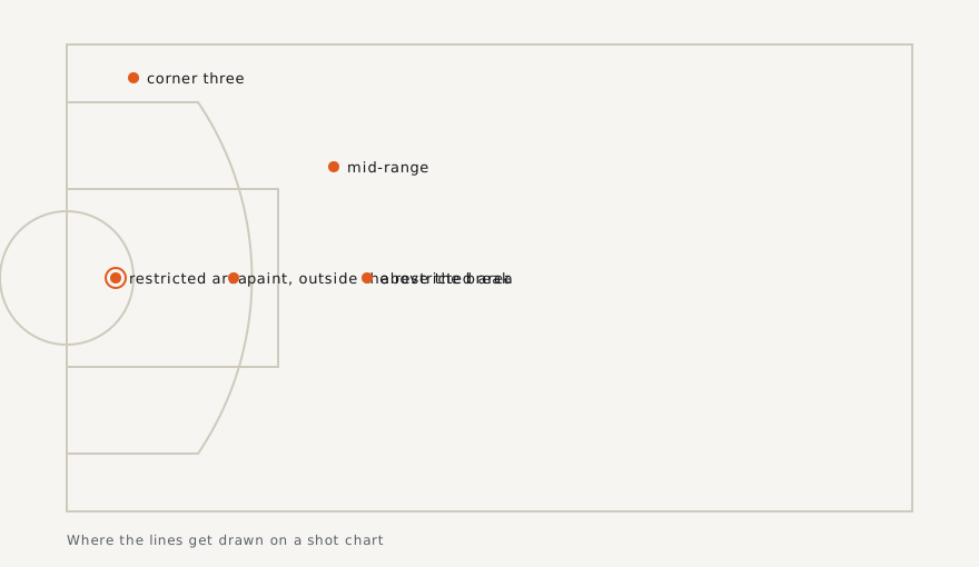
A chart has to group attempts, because a scatter of individual dots is unreadable past a few hundred shots. The conventional grouping divides the floor into zones, and the zone boundaries are where most of the editorial content of a shot chart lives.
The restricted area immediately under the rim is almost always its own zone, because shots there convert at a rate unlike anywhere else and mixing them into a larger paint zone drags that zone's numbers up. The rest of the paint is usually separate. The mid-range is often one large zone, which flatters it or damns it depending on where its inner boundary sits — a mid-range zone drawn tight to the paint will show a better conversion rate than one drawn out to the arc.
Behind the arc, the corners are separated from the rest, and that separation is not cosmetic: the corner three is a shorter shot than one taken straight on, so merging them into a single three-point zone hides a real difference. A chart that does not split the corners is making the corner look worse and the top of the arc look better than either is.
Some charts abandon zones for a hexagonal grid, which trades clean boundaries for uniform cells and introduces its own artefact: a cell containing two attempts gets coloured as confidently as one containing two hundred unless the designer does something about it, and designers frequently do not.
Decision two: what the colour means
This is where most misreading happens. Colour on a shot chart can encode at least three different things, and they look identical.
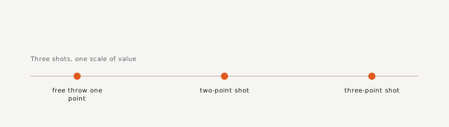
It can encode raw conversion: what share of attempts from here went in. It can encode points per attempt, which rescales the three-point zones upward because those shots are worth more. Or it can encode a comparison — this player's conversion from this zone against some baseline, usually the league's rate from the same zone.
The third is the most informative and the most frequently mistaken for the first. A chart showing a mid-range zone in cool colours against a league baseline is not saying the player shoots badly from there in absolute terms; it is saying he shoots worse from there than the average player does. Those are different claims and only one of them is usually the point.
Decision three: what the size means
Most good charts encode volume as well as rate, usually as the size of a marker or the opacity of a zone, because a rate without a volume is not a finding. A small, dark cell at the top of the arc may represent three attempts across a season. If the chart has no volume channel at all, every zone is being presented with equal confidence, and that is a misrepresentation of the data rather than a simplification of it.
What a shot chart cannot show
It cannot show whether the shot was open. Two attempts from the same square foot, one uncontested after three passes and one taken over a hand with the clock expiring, are the same dot. Contest level is tracked now, but it is almost never in the picture, and its absence is why shot charts are better at describing where an offence goes than at judging whether it should have.
It cannot show who created the attempt. A corner three is usually the end of somebody else's work. A chart credits it entirely to the shooter.
And it cannot show the attempts that did not happen. The most interesting thing about a shot chart is often the empty region, and emptiness has at least two causes that look identical on the page: a player who refuses those shots and a player whose offence never produces them.
Reading one properly
Find the zone boundaries first and check whether the corners are split. Find out what the colour encodes before interpreting a single hue. Check whether volume is encoded at all. Then read the empty space as a question rather than an answer. Done in that order, a shot chart is one of the most information-dense objects in sports graphics. Done out of order, it is a mood board.